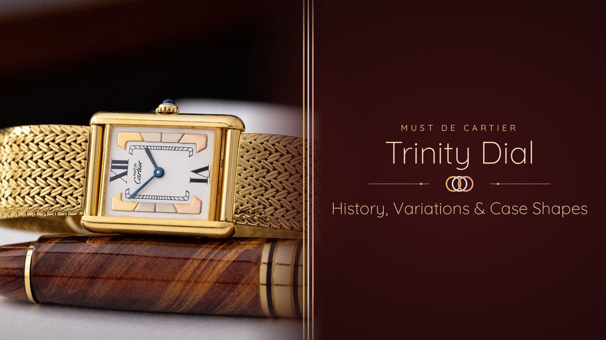

If you're looking at a Must de Cartier and wondering about the three-tone stripes on its dial, we've got you covered. The Cartier Trinity dial borrows its colours from a ring Louis Cartier introduced in 1924: three interlocking bands in three shades of precious metal. This guide explains where that ring came from, who made it famous, and how it reached the vintage Cartier watches collectors look for today. Then we'll get into case shapes and every variation worth knowing.

1924: The Trinity Ring and What It Stands For
Every Cartier Trinity dial starts with a ring. In 1924, Cartier released a ring made of three interlocking bands in platinum, yellow gold and rose gold. None of the bands sits above the others, so they roll freely around each other with no visible join anywhere.
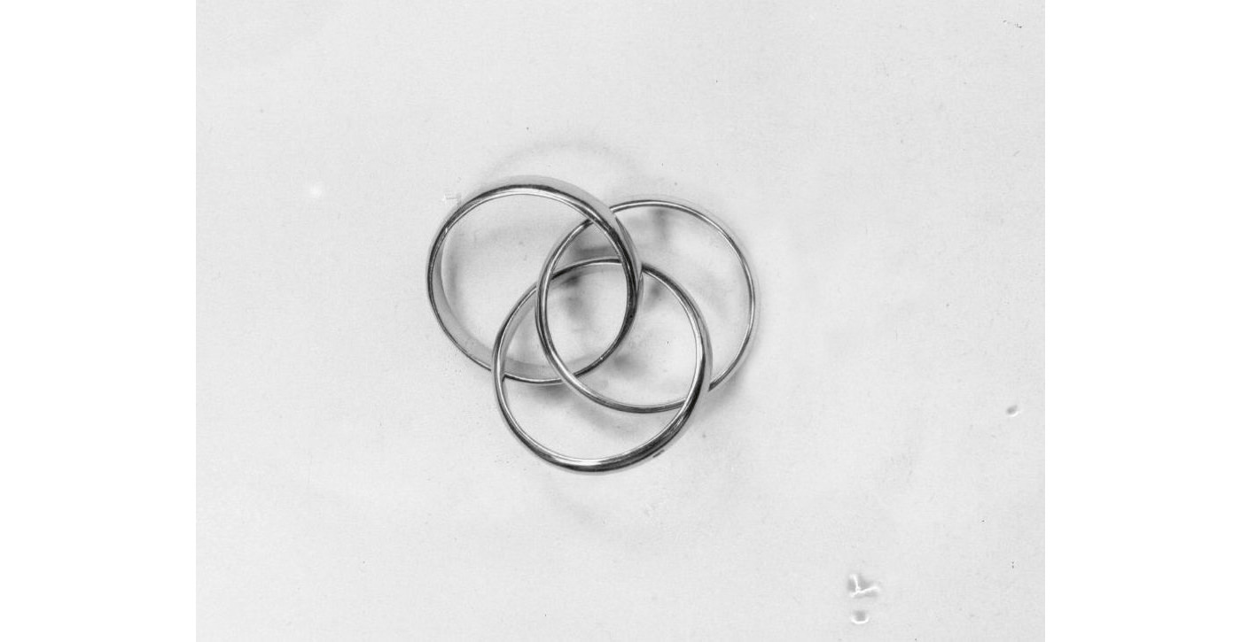
Source: Europastarjewellery
It was a sudden move for a house known for gemstones, and it worked. By 1925, American Vogue was already featuring the ring alongside a matching bracelet. The three-band motif has stayed in Cartier's collection ever since.
Three Metals, Three Bonds
The three bands have come to stand for three bonds: friendship, fidelity and love. It's a simple and emotional, and that's why it has lasted till now. You don't need to know anything about jewellery to resonate with this collection.
The name opens another door. "Trinity" echoes the Holy Trinity, and it's easy to read a spiritual meaning into three bands joined as one. Still, it's part of the appeal, because each owner decides what the three bands mean to them.
Cartier frames the ring as a milestone gift. The house describes it as the present that marks the passage into adulthood, for men and women alike. That's a big part of why so many Trinity pieces carry family stories.
A Name From Vogue, Not From Cartier
Here's a detail most histories skip: Cartier didn't call it Trinity. In Paris the house knew it as the three-band, three-gold ring, and that's the name in its archives.
The word Trinity came from American Vogue, which described "the very new Trinity bracelet and ring" in 1925. The name stuck in the United States. Cartier registered it only in 1997, after noticing how neatly one word summed up the design. Pierre Rainero, Cartier's image, style and heritage director, set out that timeline in an interview with Europa Star.
The metals changed too. Platinum was the white precious metal of 1924, because white gold alloys weren't yet good enough. White gold gained ground from the 1930s and later took platinum's place in the ring.
That matters when you look at a watch. The Cartier Trinity dial on a Must de Cartier follows the later palette of yellow, white and rose tones. You won't find the original platinum trio on a dial, so don't expect it.
From Gemstones to Pure Form
The Trinity didn't arrive as a sudden flash of inspiration. It came out of a slow change in how Cartier thought about jewellery, and that change is the whole point of the ring.
Before the First World War, Cartier's name rested on the garland style: diamonds set in fine platinum, in patterns of bows, wreaths and lace. The value of a piece sat in its stones. The metal was there to hold them and, ideally, to disappear.
Louis Cartier had been moving away from that for two decades. He made the Santos for the aviator Alberto Santos-Dumont in 1904, then the Tank in 1917. Both are built from plain geometry, with nothing on them.
The Trinity turned the old formula around. There are no stones at all, so the metal becomes the whole design.
That idea landed well. Over the decades Cartier tried versions with five, seven and even nine bands. A seven-band bracelet followed in 1967.
Each step took the Trinity further from the jeweller's showcase and closer to everyday life.
Introduced: 1924, as a stock item designed under Louis Cartier
Original metals: Platinum, yellow gold and rose gold; white gold later replaced platinum
The name: First used by American Vogue in 1925; registered by Cartier in 1997
What it stands for: Friendship, fidelity and love (the colour-by-colour pairing is lore)
On the watch: The Trinity dial appears on Must de Cartier watches from around 1980
Jean Cocteau: The Poet Who Made Trinity Famous
If the ring had a first ambassador, it was Jean Cocteau. By the early 1930s, he'd made the three-band ring part of his public image.
Who Jean Cocteau Was
Jean Cocteau was a French poet, novelist, playwright, artist and filmmaker.
He moved easily between the art, theatre and film worlds of interwar Paris. His taste carried weight, so what he wore was noticed and copied.
A Friend of Louis Cartier
Cocteau's link to the house ran deeper than one ring. He was a friend of Louis Cartier, and he'd praised the jeweller in verse as early as 1910. For La Belle et la Bête, he borrowed real Cartier diamonds to play the tears on screen.
The friendship outlived Louis Cartier, who died in 1942. When Cocteau joined the Académie française in 1955, Cartier Paris made the ceremonial sword he designed for himself. It now sits in the Cartier Collection, a reminder that his bond with the house was real and lasting.
Two Rings on the Little Finger
Cocteau didn't wear one Trinity; he wore two, stacked on his little finger, so six bands sat piled together. It was an unusual way to wear a ring then, and still is.

Source: Vogue
Photographs of Cocteau wearing the pair date from the early 1930s. That's when he was in a relationship with Natalie Paley, the Russian-born princess and actress. According to Rainero, research by the Comité Cocteau found letters between the two that refer to the ring in their own private symbolism.
For those two, the rings stood for their relationship. For everyone else, they became Cocteau's signature. The three-gold ring turned into a badge of artistic freedom and individuality, worn by people who wanted to be seen as ahead of their time, that's why this collection is called avant-garde.
It also landed at the right moment for men's jewellery. By the early 20th century, most men wore little beyond a wedding band, a signet ring, a pocket watch and a tie pin. The Trinity fitted that world, it could pass for a more original wedding ring, and it didn't have to sit on the ring finger.
Cocteau's Vision for the Ring
Cocteau didn't design the Trinity; What he brought was a vision. Cocteau showed that the three bands could mean whatever the wearer wanted them to mean. Every Trinity since, including the dial on a Must de Cartier, carries a little of that freedom.
From Gary Cooper to Grace Kelly and Beyond
Cocteau's way of wearing rings became trendy. Gary Cooper wore a Trinity in a 1931 portrait. In the 1940s the Duke of Windsor took it up, according to Francesca Cartier Brickell, author of The Cartiers and a member of the family.

After the war, film stars carried it further. Grace Kelly wore her Trinity at the Cannes Film Festival in 1955, and Romy Schneider and Alain Delon wore theirs too. Later, Princess Diana was among its best-known wearers.
Source: Vogue

Source: MarieClaire
The watch has modern fans too. Tyler, the Creator has built much of his collection around vintage Cartier, and it includes a Must de Cartier Tank. He's also been linked to a round Cartier reported as a "Trinity Ronde".
 Source: GQ
From Ring to Wrist: How Trinity Reached the Must de Cartier
Necklaces, bracelets and earrings followed the original ring over the decades. The watch is a bit of different story. To understand the Cartier Trinity dial, you need to know about a business rescue in the early 1970s.
Les Must de Cartier, 1973
In 1972 a group of investors led by Robert Hocq bought Cartier Paris. Hocq had made his money in lighters, and he understood objects people wanted but couldn't quite afford. He brought in Alain-Dominique Perrin to run the new venture.
In 1973 they launched Les Must de Cartier. The idea was simple: recognisable Cartier design at a price more people could reach.
It worked. The line brought a new generation of clients to Cartier. By 1981 there was even a Les Must version of the Trinity ring, in white, yellow and rose gold, with an engraving on the rose band.

Source: Cartier
Trinity Moves Onto the Dial
Around 1980, Cartier put the ring's three colours onto the dial itself.
We think it made sense from the first moment. The Must line was built on familiar Cartier codes, and the Trinity was the house's most recognisable jewellery design. Putting it on a Tank joined Cartier's two founding shapes, the 1917 case and the 1924 ring, in one object.
Our guide to Must de Cartier dials places the Trinity among the line's other dial families. In this article, we go deeper on the Trinity alone. We'll cover each layout, how to tell them apart and what they're worth.

The Must Tank and Its Vermeil Case
The watches arrived in 1976--77 with the Must de Cartier Tank. Instead of solid gold, vermeil was used: sterling silver with a layer of gold electroplated over it. You'll see a 925 silver hallmark on the caseback. It gave the watch the colour and weight of gold for a fraction of the price.
Early Must Tanks used manual-wind movement. From around 1981, Cartier moved the line to quartz calibres such as the 057 and 690.
The numbers show how well the formula landed, as Cartier went from roughly 3,000 watches a year to more than 160,000 by the end of the 1970s. Our Cartier Tank guide covers the full model family if you want the wider picture.
What a Trinity Dial Must Tank Looks Like in the Hand
Take a typical example from our own bench, a Must Tank ref. 590005. The vermeil case measures 23 × 30 mm and just 6 mm thick, with a cabochon crown and a Cartier cal. 690 quartz movement inside. The white dial carries black Roman numerals, with the three gold tones of the Trinity motif set into it.
On the wrist, the Trinity dial reads firstly as jewellery. The three tones shift as the light moves, which a plain ivory or black dial can't do. At the same time, the Roman numerals and railway track keep it legible, so it still works as an everyday watch.

Trinity dials appear on more than one case shape, though. The rectangular Tank is the best-known home for the Cartier Trinity dial, but it isn't the only one, and that's where we go next.
Case Shapes: Must Tank and Must Vendôme
You'll find the Cartier Trinity dial in two Must de Cartier case shapes: the rectangular Tank and the round Vendôme. Both came in vermeil, and both carry the same Cartier codes. Lets get into it.
The Must Tank: A Case Drawn From the Battlefield
Louis Cartier drew the Tank in 1917. He took its lines from the Renault FT-17, the light tank used on the Western Front in the First World War. Seen from above, the tank's tracks became the two vertical sidebars, or brancards, that frame the dial.
The first production model, the Tank Normale, followed in 1919. Its flat, geometric case looked nothing like the round watches of the day. That's exactly why it has lasted, because there was nothing on it to go out of fashion.
On the wrist, a large Must Tank reads as a proper unisex dress watch. The small model sits closer to jewellery. With a Trinity dial, the small size leans even further that way.

The Must Vendôme: A Round Watch Named for a Square
The Vendôme takes its name from Place Vendôme in Paris, the square long associated with the city's grand jewellers. Cartier's Paris flagship has stood since 1899 at 13 rue de la Paix, the street that runs north from the square.
The case is round, thin and almost unbroken, and the strap seems to float from it. Collector lore says the two strap attachments stand for the two streets that lead into the square: rue de la Paix and rue de Castiglione. It's a nice story, so enjoy it, but treat it as lore.

Source: Thejewellerydial
The attachment itself has a documented history. In 1934 Louis Cartier patented a new way to fix a strap: a bar passing through a central loop on each side of the case. Cartier used it only occasionally at the time.
The patent expired in 1949, and that same year Pierre Arpels used the idea on a watch for himself at Van Cleef & Arpels. Cartier brought it back in 1973 on the Vendôme, and Gérald Genta later made it famous on the Pasha de Cartier. Quill & Pad tells the full story of that shared design.
Tank or Vendôme: How They Compare on the Wrist
Choose the Tank if you want the classic Cartier outline and the widest choice of Trinity dials. Vertical stripe, Roman-numeral and side Trinity layouts all appear on it. It also has the deeper market, so you'll find more examples to compare before you buy.
Choose the Vendôme if you prefer a lighter look. It suits smaller wrists and sits well next to a Trinity ring or bracelet, obviously. It's also the more affordable way into the Trinity dial, which matters if this is your first vintage Cartier.
What it is: 925 sterling silver with a layer of gold electroplated on top
How to confirm it: Look for the 925 silver hallmark on the caseback
Where it wears: Brancard edges, case corners and around the strap attachments
Worth knowing: Light plating wear is honest and normal. A replated case looks new, but it's no longer original

Cartier Trinity Dial Variations
Here are the Cartier Trinity dial variants you're most likely to meet, in brief. Dealers name them differently, so go by what you see on the dial and case.
| Photo | Variant | What you'll see | Case and size | Movement | Era |
|---|---|---|---|---|---|

|
Vertical stripe, narrow | Thin bands of yellow, white and rose gold tones run top to bottom; no numerals, just the signature and blued sword hands | Must Tank, vermeil, usually large (about 23 × 30 mm) | Manual wind, Cartier cal. on ETA 2512-1 base | c. 1980 to early 1980s |
 |
Vertical stripe, wide | The same three tones in broader bands; no numerals | Must Tank, vermeil, usually large | Manual wind, ETA 2512-1 base | c. 1980 to early 1980s |
 |
Must Tank ref. 5057001 | Three-tone stripes in the middle of the dial, framed by a white chapter ring with black Roman numerals and a railway track | Must Tank, vermeil, small (20 × 28 mm) | Quartz, cal. 057 | Quartz era (from c. 1981) |

|
Side Trinity | The three tones sit to one side of a white dial; Roman numerals only at 12 and 6 | Must Tank, vermeil | Quartz | Quartz era |
 |
Must Vendôme, Trinity dial | Stripes of the three tones across a round dial, with Roman numerals and a railway track on some examples | Must Vendôme, vermeil: e.g. ref. 590004 (24 mm) and ref. 590003 (30 mm) | Quartz (cal. 90 on listed examples) | c. 1989–1993 examples |

|
Trinity round, ref. 2357 | The Trinity sits in the bezel: three intertwined gold rings set with diamonds, around a white dial | Round, solid 18k tri-colour gold, about 26–27 mm | Quartz | 1990s (dealer listing) |

|
Three-Gold Vendôme | Classic Roman dial; the Trinity sits in the case, built from yellow, rose and white gold bands | Solid 18k Vendôme, Louis Cartier line | Quartz, cal. 81 | Early-1990s example documented |
What to Check Before Buying a Trinity Dial Watch
A Cartier Trinity dial watch is an excellent way into vintage Cartier, but you should check some points before considering buying them. We compiled a list of them, so you don't have to.
Start With the Seller: Reputation and Transparency
Firstly look at who's selling it, their approach and transparency. A good seller shows the dial straight-on, the caseback, the crown, the edges of the case and, ideally, the movement.
Ask direct questions. Ask when the watch was last serviced and by whom, whether the dial has been touched and whether the crown is original. A seller who answers clearly, in writing, is worth more than a low price.
Check the return policy too. Even an honest seller can miss something, and a return window gives you time to have the watch checked by your own watchmaker.
The Dial: Originality, Condition and the Right Layout
The Trinity dial is the reason you're buying the watch, so give it the most attention. First, check that the layout matches the watch. A vertical stripe dial belongs in a manual-wind case, while the quartz years brought Roman-numeral layouts such as ref. 5057001 and the side Trinity.
Next, look at the three gold tones. They should be clearly different from each other and evenly finished across their bands. Light toning in one corner is common and honest, but scratches across the stripes can't be polished out without harming the dial.
Finally, check the printing. The "must de Cartier" signature and any Roman numerals should be crisp, evenly spaced and consistent with known examples of the same reference. Blued sword hands should be even in colour, with no silvery patches where the bluing has worn or been redone.
Case, Crown and Movement
Turn to the vermeil case next. Look for the 925 silver hallmark on the caseback, and check the brancard edges and case corners for plating wear. A little wear is fine; a suspiciously perfect case may have been replated.
The crown should carry its blue cabochon, domed and polished. A flat, pale or chipped stone usually means a replacement. On a quartz watch, ask for a photo of the movement, because an old leaking battery can leave corrosion behind.
On a manual-wind Must Tank, a recent service matters most. These movements are reliable, but a watch that has sat in a drawer for decades needs cleaning and fresh oil. Our guide to servicing vintage watches explains what a proper overhaul includes.
The Cartier Trinity dial packs a century of Cartier into a few square centimetres. It carries Louis Cartier's 1924 ring, the Paris of Jean Cocteau and the Must de Cartier idea that brought the house to a new generation. Few vintage watches tell that much story for the money.
Whichever layout you choose, buy the dial first and the price second. An honest, original Trinity dial in a sound vermeil case will outlast any bargain with a question mark over it.
When you're ready to look, browse our vintage Cartier collection for Trinity dials and other Must de Cartier pieces.
Your Questions Answered
Frequently Asked Questions